Over 1 million brands and advertisers are on Instagram, so finding a unique and great Instagram aesthetic for yours can be difficult.
Luckily, you don’t have to start from scratch, since there are so many great accounts to learn from.
These 5 small businesses have done an incredible job establishing visual strategies and then consistently posting within that art direction. Here are some tips to kickstart inspiration for your evergreen Instagram content:

#1: Make Your Products the Star like Goldenrod Pastries
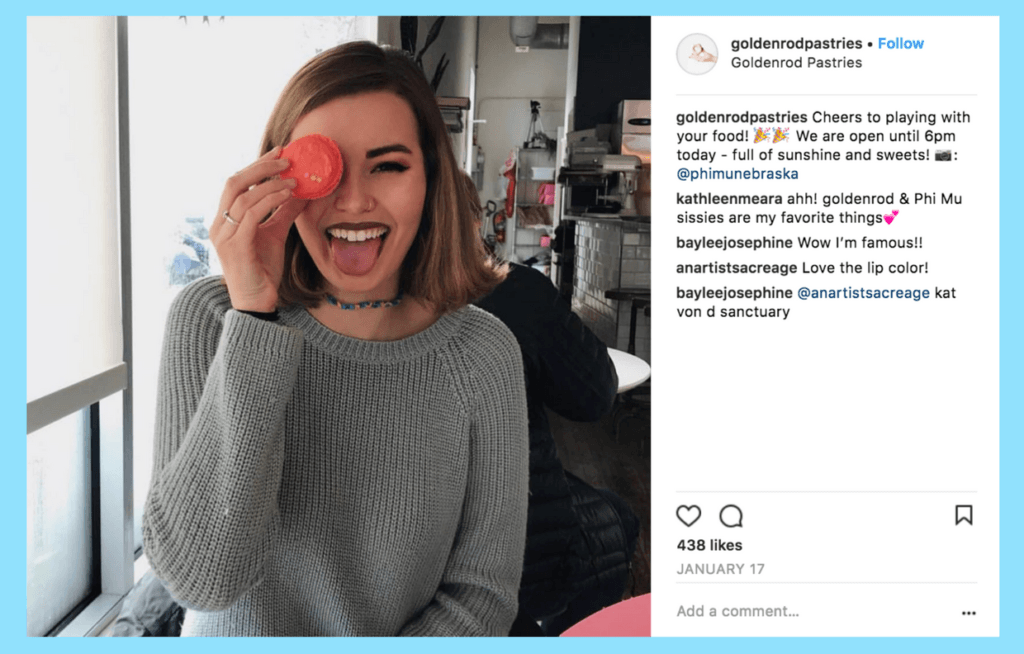
Even if you don’t live in Nebraska, the product shots from Goldenrod Pastries will make you want to book a flight to Great Plains. The bakery does an excellent job mixing studio-quality food photography with lifestyle content to create a great Instagram aesthetic for their brand.
Sometimes when you’re chasing marketing objectives and balancing promotions you can forget that your products are the reason your followers are engaging with your brand in the first place. Goldenrod Pastries finds fresh ways to always bring the focus back to their sugary goodness in every post.

Although your brand needs to publish a diversity of content to keep your feed feeling fresh, straying too far from your main offering can confuse your audience.
To get around this issue, try to find small ways to integrate your product or service into your posts, like an automotive brand showing car keys in an otherwise car-free post.
#2: Create Original Designs that Communicate Your Brand’s Vision Like Molasses Books
While scrolling through the feed of Brooklyn shop Molasses Books, you could be easily fooled into thinking that they regularly features images of book covers. Look a little closer though, and you’ll notice that each of these is a promotional image for Bushwick Chess Night, an event in the store.
These original images fit perfectly with Molasses’ lo-fi used-paperback aesthetic — an important strategy so that their Instagram aesthetic doesn’t end up looking clogged with a variety of different art directions, colors, and styles.

If your brand posts a mix of lifestyle photography and promotional updates, use these book covers as inspiration to integrate the look of the event with the rest of your Instagram aesthetic.
For example, a textiles brand might create original textile designs with information about an upcoming gallery opening, or a music brand might produce LP sleeves that detail information about a future show.

#3: Create a Color Palette in your Instagram Aesthetic and Stick to It
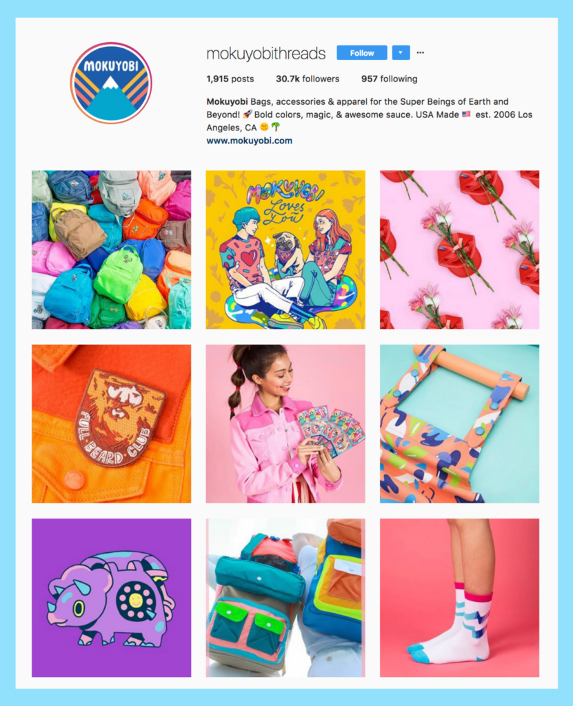
The first thing you might notice when you visit Mokuyobi Threads’ Instagram profile is its neon Lisa-Frank-goes-to-Coachella colors. The LA fashion brand prioritizes consistent hues in their product and their online presence, so they have a predefined color palette to work with.
This is a super simple strategy that really boosts your profile’s overall impact. These color choices come out even when Mokuyobi Threads casts models — each has an uncommon hair color, perfectly complimenting their great Instagram aesthetic and brand personality.
Think about the kinds of feelings or emotions you want your audience to get from visiting your brand’s profile.
A young, fun, excited brand like Mokuyobi Threads perfectly nails the retro-rainbow palette, but a cloud computing service may not have the same success. Planning out these moods and what colors are associated with them is a fun, simple way to revitalize your Instagram strategy and build a great Instagram aesthetic.

#4: Minimize Clashing Photography Styles by Grouping Similar Photos Together
Even though it’s a ceramics studio in North Carolina, East Fork Pottery is similar to Goldenrod Pastries in that it combines great product photography with lifestyle content. However, while Goldenrod’s photography appears to come from one source, East Fork does a great job of integrating multiple sources and photography styles into their feed.
This will sound familiar to anyone who has managed a social account for a brand with many different stakeholders and departments! The way East Fork makes it work is by unifying their content in other ways, like grouping photos with a similar Instagram aesthetic into consecutive posts.
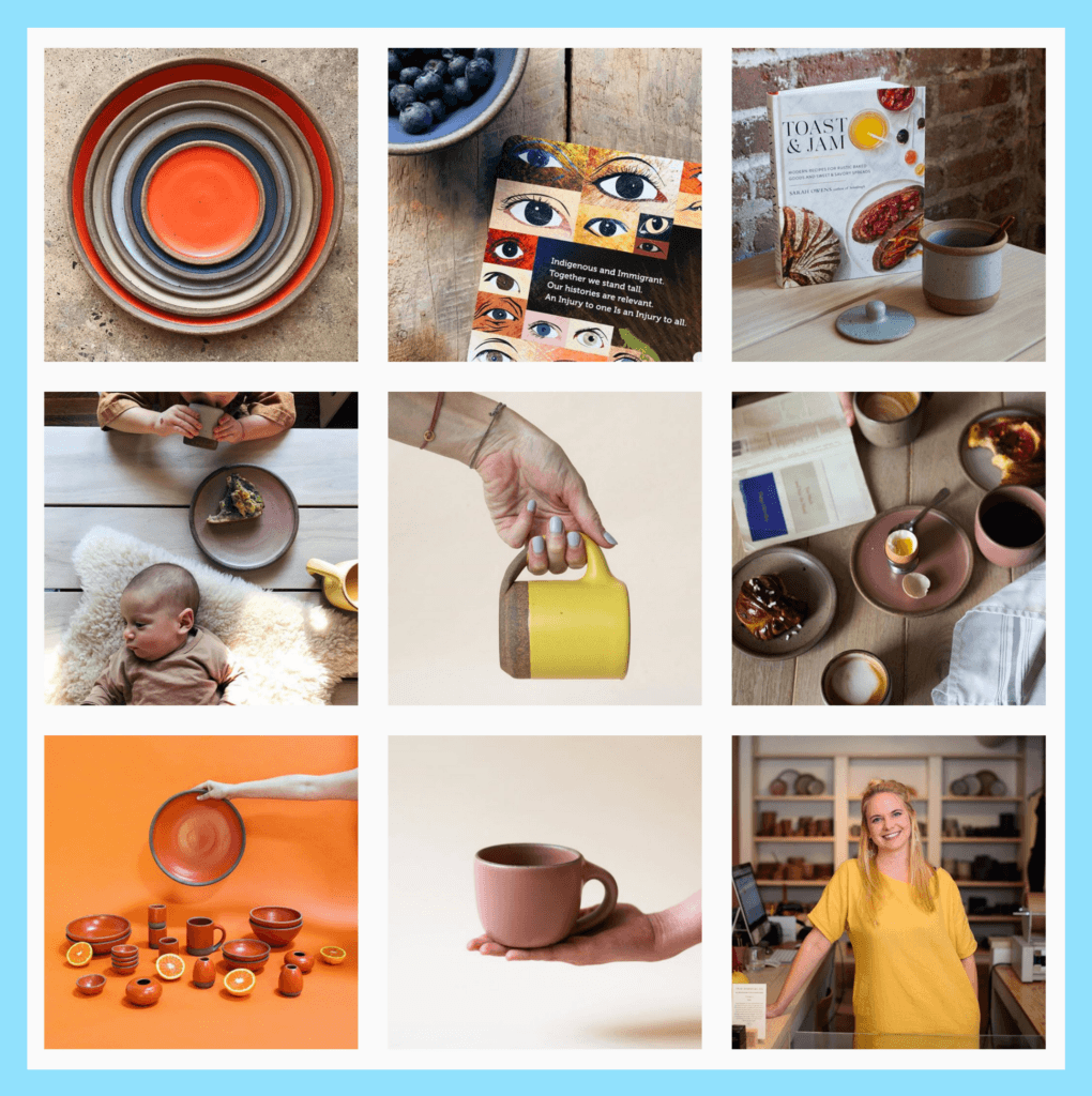
They also consistently add a slight grain to each of their photos, which adds a subtle analog feeling to the content.
If you’re dealing with a lot of clashing content sources — maybe event photography next to studio stills — experiment with adding subtle, unifying filters to your content. For example, you can add a slight hue to all of your photos or slightly desaturating every shot. You can also play around with subtle branding like The Dodo.

#5: Look to Your Community for Great Content
Shopping for an organic buddy in NYC’s Lower East Side will invariably draw you to The Sill. An amazing plant shop that curates an inspiring online presence, The Sill is known for its combination of boho wisdom and peaceful visuals.
The account supplements original content with regrams from #plantstagram all the time. When you, as a social content strategist, can’t build posts yourself due to time or resources, look at the possibility of posting user-generated content (UGC) with credit. (The keyword here is “credit.” It’s super important to follow the rules when reposting UGC to Instagram!)
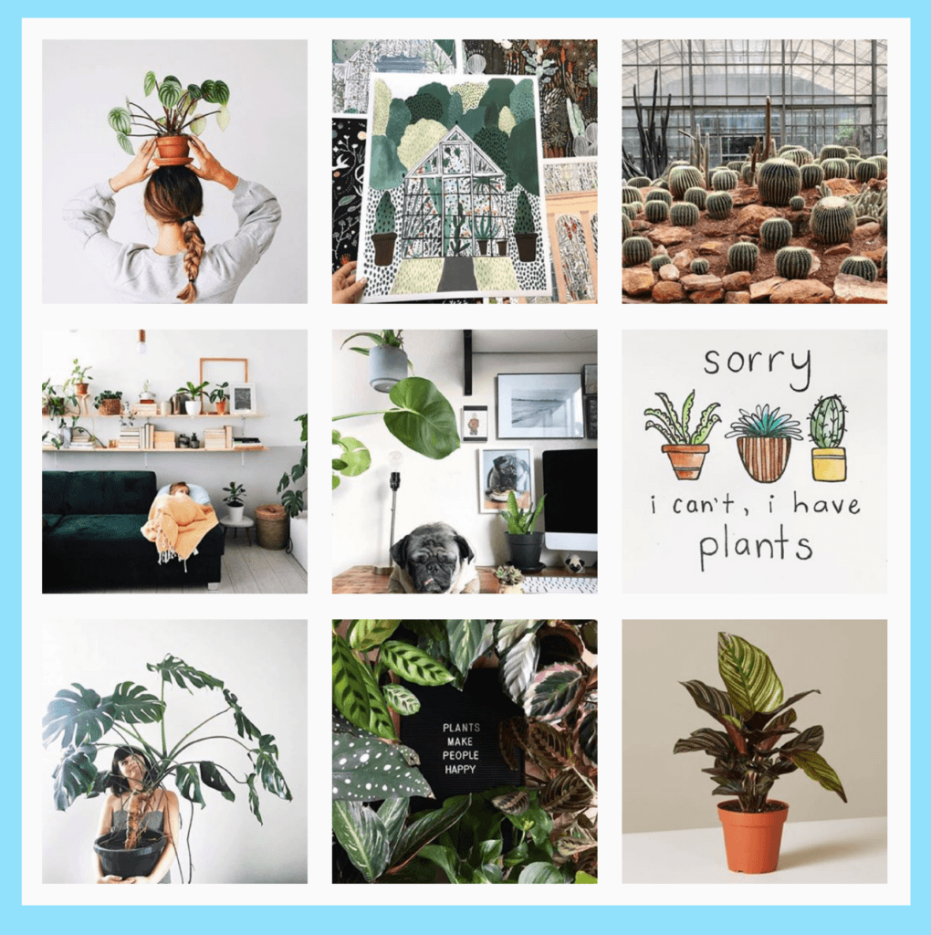
Regramming gives you less control over the month-to-month look of your feed, but accounts like The Sill have found such great content (and built such a ravenous community) that it manages to work in their favor.
Take a peek at the hashtags your community might be using. A hometown soda brand might explore obvious hashtags like #soda and #drinks, but don’t be afraid to try other avenues like #picnic, #virgincocktails, and #coolforthesummer to see what your community is getting up to!

After trying some of these suggestions, you should be able to rethink your posting strategy and create a great Instagram aesthetic for your business! Hopefully, just being conscious of these options will make you feel like you have more tools at your disposal in order to make incredible posts that your audience will love.
Sign up for Later’s Free Instagram Course to get a ton of tips on how to design, curate, and plan your Instagram feed!
